“Smarter Data for a Greener Future”

Category: Data Analytics

  • Sustainable computing practices: When “clean” tools aren’t clean

    Most people think the sustainability fight is about switching to electric cars, ditching plastic straws, or planting trees in some far-off offset program. But the hard truth? Even the tools built to save the planet quietly siphon energy, burn carbon, and leave their own digital soot behind. A focus on sustainable computing practices is the best way to reduce your impact.

    Sustainable computing practices make a difference when it comes to environmental impact.

    Why it hurts when clean tech feels dirty

    You know that uneasy feeling when you do something good but suspect it might not be good enough? That’s the elephant in the server room of modern sustainable computing practices. We’re surrounded by tools and platforms that promise to shrink our environmental footprints. But peel back the interface, and you might find a fat carbon bill quietly humming under the hood.

    Sustainability dashboards. Eco-optimizing apps. Footprint trackers. They all swear they’re fighting climate change. And maybe they are. But too often, the tech built to save the planet ends up burning it a little more instead.

    The myth beneath the glossy interface

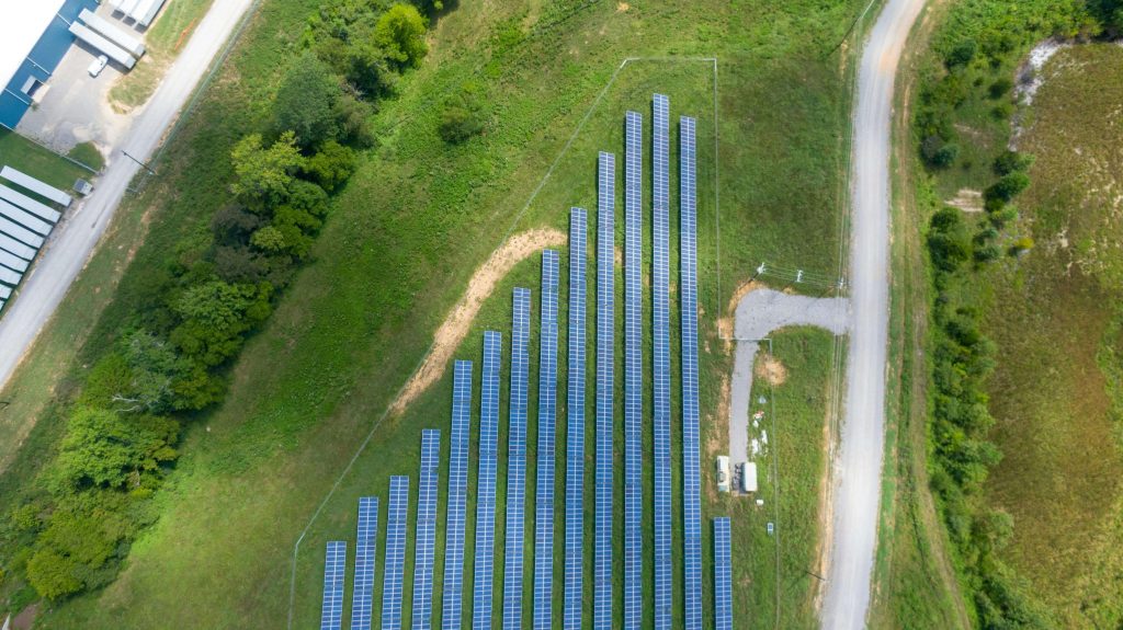
    Clean tech doesn’t come from a magic wand. It comes from mining, manufacturing, and machines running hot. Solar panels degrade. Wind turbines require rare materials. AI models that predict energy usage often consume more training power than a family home uses in a year.

    And the apps? The dashboards? The “insights”? They aren’t free. Just because something helps you reduce emissions doesn’t mean it cost nothing to build or maintain. In digital sustainability, most of the burn happens behind the scenes.

    Building Petrichor meant building with constraint

    When I was building Petrichor, a platform to help users understand and reduce their digital footprint, I wanted to include AI features. But not at the cost of increasing the very thing we were trying to fight.

    So we ran the math. We mapped out what features we really needed. Then we hunted for smaller, leaner AI models that could deliver just enough intelligence without chewing through unnecessary power. No massive LLMs guzzling GPU time. Just purpose-fit models doing quiet, effective work.

    We applied core principles like energy efficiency and carbon awareness, similar to the Green Software Foundation’s sustainability principles, to ensure every feature justified its environmental cost.

    Every feature had to earn its place. If it couldn’t prove it was net-positive for the environment, it got the axe.

    Where most sustainable computing teams still get it wrong

    Too many so-called “sustainable” platforms are green in name, not in architecture. They love to brag about the emissions users avoid, but never disclose the emissions their backends generate to make that calculation.

    It’s like driving a hybrid car to a climate summit, but forgetting to mention you flew first-class to get there. The issue isn’t deception. It’s habit. We measure what’s visible. We market what photographs well. We don’t ask if our interventions actually deliver a net gain.

    What real sustainable computing practices in tech look like

    Here’s what we’ve learned on the ground:

    • Track the full lifecycle: Code, compute, cloud hosting; it all has a footprint.
    • Design for less: More features mean more complexity. More complexity means more energy.
    • Use intent as a constraint: Every idea must answer a tough question: does this reduce impact or just make us feel better?

    You don’t need to be perfect. But if you’re flying a green flag, you damn well better mean it.

    The invisible wins that make the real difference

    The biggest gains weren’t glamorous. They came from small, disciplined choices:

    • Optimizing queries so servers work less
    • Spinning down idle instances to save power
    • Avoiding redundant data tracking that bloats storage and compute cycles

    Those changes don’t make the slide deck. But they make the difference between clean tech and performative tech.

    Build with honesty and sustainable practices, or don’t bother

    If your roadmap includes a sustainability slide but not a single question about your server architecture, start over. Digital sustainability in tech isn’t about marketing optics. It’s about taking real responsibility for what your product burns, not just what it says.

    And if you’re staring at a feature backlog that includes words like “AI,” “insights,” and “dashboard,” but haven’t yet calculated their carbon toll, we should talk.

    Because if your product claims to be a cure, but ends up being another form of quiet pollution, the planet won’t care how clean your font is. It’ll just feel the heat.

    Let’s build something real. Something intentional. Something that stays clean behind the scenes.

  • Measure What Matters analytics: Stop measuring what you can’t fix

    You launch the sprint review. The metrics deck lands on the screen: customer churn, social media mentions, page load times, net promoter scores. Silence. No one speaks because no one knows what action any of it demands. That’s the quiet killer of analytics culture. We gather numbers, not because they guide us, but because they exist. Measure What Matters analytics is a rebellion against that.

    Measure What Matters analytics and how to use it for optimal results.

    Measure What Matters analytics cuts through dashboard clutter

    At first glance, more data feels better. Like carrying ten tools into the woods instead of three. But soon you realize: you’re lugging around weight you never use. I once worked with a mid-market retailer swimming in metrics. Their dashboards sparkled with data points, but the meetings were jammed with questions like, “Why did our click-through rate fall?” and “Is this drop in engagement seasonal or a red flag?” Nobody knew, because the team hadn’t decided which metrics were fixable and which were just… interesting.

    In “Entrepreneurs: Beware of Vanity Metrics,” Eric Ries highlights how metrics such as page views or sign‑ups “look great on paper but aren’t action-oriented.” He recommends evaluating every metric through three criteria: is it actionable, accessible, and auditable, to ensure your KPIs drive meaningful change, not just decoration.

    Vanity metrics create a false sense of security

    This is where things get dangerous. Metrics like brand awareness, sentiment score, or total impressions look fantastic on slides. They give off a warm glow. But they’re like mood lighting—nice ambiance, no clarity. If your bounce rate jumps, you can adjust page layout or navigation. If brand sentiment dips, well, maybe tweet less? The Measure What Matters analytics approach demands every metric earn its spot by answering this: what will we change if this moves?

    Use business value questions to separate signal from noise

    This is where my favorite teaching moment lands. I run a class on business value questions. We start with the basics: Is this problem worth solving? If yes, does it need a data insight or a process change? That small, structured pause is where most companies flail. They chase data because it’s available, not because it’s useful. When you ask those questions up front, you reclaim agency. You stop reacting and start designing.

    Run a KPI audit with action at the center

    So let’s talk tactics. Here’s how you pivot to Measure What Matters analytics:

    1. Actionable mapping: For every metric, write down the next step if it goes up or down. If you draw a blank, the metric fails.
    2. Fixability score: Tag each KPI as Fixable this sprint, Fixable this quarter, or Not fixable. Be ruthless. Cut or sideline anything in the third bucket.
    3. Dashboard pruning: Keep only the metrics that directly tie to levers you can pull now. The rest can live in an appendix or a quarterly strategy doc.

    From data paralysis to product momentum

    One product team I coached trimmed their dashboard to three metrics: Cart Abandonment, Checkout Completion Time, and First-Click Conversion. Every one of those tied to a known lever. That week, they dropped two unnecessary forms from checkout and saw a measurable lift in conversions. Suddenly, meetings became exciting again. People showed up ready to build, not just stare at charts.

    Measure What Matters analytics doesn’t mean flying blind

    This isn’t about ignoring context. You still track the slower, squishier numbers like brand lift or long-term retention—you just don’t let them drive the bus. You move them off the core dashboard and into strategic reviews where they belong. Measure What Matters analytics gives you permission to stop performing data theater and start fixing things.

    Don’t worship dashboards. Build outcomes

    Data should feel like a wrench in your hand, not a painting on the wall. Every metric that survives your audit should demand action. If your KPIs aren’t unlocking new behavior, they’re just decoration. There’s real power in walking into a room and saying, “We measure less, but we fix more.”

    Want help building your version of this?

    This is where I come in. Whether it’s retooling dashboards, coaching teams through KPI audits, or teaching your org how to ask better business value questions, I help companies reclaim momentum. Analytics shouldn’t be a tax on your time. It should be a springboard. Let’s talk about what you actually want to move and how to measure only that.

  • AI adoption challenges (and what to do about them)

    Your team launches an AI tool. The tech is solid, the data is clean, the hype is high. And then… nothing happens. Adoption flatlines. Users ghost the dashboard. Efficiency gains vanish into the fog of “maybe next quarter.” This is the normal lifecycle for AI adoption challenges.

    Here’s the part nobody wants to admit: the AI isn’t broken. But the rollout is.

    AI adoption challenges. The struggles and solutions for getting your team on board with AI.

    People want to adopt AI, but then don’t know how

    I worked with a company recently that built a brilliant AI system for internal process optimization. It could’ve saved hours of manual data entry and decision-making across several teams. But they skipped one step: training. Not technical training for engineers, but hands-on, accessible onboarding for the non-technical folks who were supposed to use it every day.

    Without it, the system might as well have been written in Elvish. People avoided it like it would steal their keyboard shortcuts. Managers mumbled about “low adoption” while quietly sliding back to spreadsheets. That AI tool didn’t fail because it was flawed. It failed because nobody bridged the gap between capability and confidence.

    I’d like to say this isn’t one of the big AI adoption challenges, but it is. Sometimes people who are constantly surrounded by technology forget how intimidating it can be. You have to be able to put yourself in the end user’s shoes and see the barriers.

    You can’t bolt AI onto a broken process

    A lot of AI projects are built like premium upgrades on a rusted-out car. Predictive models on top of vague workflows. Chatbots over inconsistent customer service policies. When AI is treated as a magic fix, it ends up exposing deeper flaws in the way teams already work. And then everyone blames the model.

    If your AI project is stalling, look sideways; not just at the tech stack, but at the workflow it’s meant to support. Does it solve a real bottleneck? Does it change how decisions are made, or does it just create another dashboard no one checks?

    No trust, no traction, no AI adoption

    People won’t use what they don’t trust. That doesn’t mean AI needs to explain every weight and vector, but users do need to know why it’s recommending what it recommends. What data it’s using. How they’re expected to act on it. When they’re still allowed to override it.

    This isn’t just anecdotal. According to Deloitte’s research on AI adoption challenges, a lack of user trust, driven by opaque models, unclear governance, and limited training, is one of the top reasons AI systems stall inside organizations.

    Give people a black box, and they’ll walk away. Give them a simple, opinionated explanation, and they’ll lean in.

    What actually works for AI adoption?

    Successful AI rollouts do a few things differently:

    • They prioritize early training for non-technical users
    • They simplify the interface so the AI disappears into the workflow
    • They identify one painful, human bottleneck and laser in on that
    • They invite feedback and visibly adjust the system

    Above all, they treat the launch as the beginning of the project, not the end.

    Let the AI disappear

    The goal isn’t to get people excited about “AI.” The goal is to make them forget they’re even using it. When done right, AI becomes ambient, just part of how work gets done, faster and better.

    If your project is stuck, don’t throw more tech at it. Get curious about the humans around it. Ask them what slows them down. Show them how this tool helps. And then get out of their way.

    (And if you want help designing an AI solution people actually use? You know where to find me.)

  • RPA process readiness: Facing automation challenges

    Before diving into robotic process automation (RPA), uncover the common RPA process challenges and how preparing your process maturity can ensure your RPA process readiness .

    RPA process readiness and robotic process automation challenges

    You sit down to automate a workflow, you hear “we want to reduce manual effort,” and you think, “This is straightforward.” But halfway through the kickoff, the process unravels. Tasks shift based on who’s handling them. Yesterday’s steps are gone today. The system is a shape‑shifter. I’ve been there.

    Recently, I sat with a company convinced their messy day‑to‑day steps could be neatly automated. We started documenting. We paused at every variable. We traced every exception. And I hit a wall: their “process” turned out to be wishful thinking. Not consistent. Not standardized. Not ready for automation.

    When the process is an illusion

    Clients often say they have a workflow. In reality, it’s tribal knowledge, spreadsheets, sticky notes, and personal hacks. For one person, step 3 is “ping Jim for status.” For another, it’s “check Slack messages.” That doesn’t just complicate your tech, it wrecks your ROI model. Without proper RPA process readiness, you put in a bot, but the bot can’t adapt to the constant twists in the steps. Instead of saving hours, it just flags errors or, worse, it executes the wrong next step.

    Shifting inputs causes RPA process challenges

    Automated tools don’t pivot well. They follow hardcoded logic, not nuance. If your process changes daily, bots will constantly break. Even low‑code automation platforms rely on predictable inputs. They need guardrails, structure, consistency. Without that, bots trigger false positives, miss key exceptions, and cause more rework than a human could. Bots solve repetition, not confusion.

    The missing foundation: process maturity

    Your process falls short when:

    • Roles change mid‑day
    • Steps depend on who is doing the task
    • Rules shift without documentation
    • Data isn’t captured in one central source

    Automation thrives when the process is ironed out first: documented steps, clear roles, stable rules.

    How to prepare your workflow for the RPA process

    1. Document actual practices, not ideal workflow
      Watch users do the work. Map every conditional branch, exception, and unexpected shortcut.
    2. Standardize roles and inputs
      Who does what, when, and with which tools? Lock that in before building bots.
    3. Track exceptions and edge cases
      If something changes, document it. Don’t ignore unusual scenarios; those are automation landmines.
    4. Iterate small and stabilize
      Automate a tiny sub‑process first. If it runs reliably every day? That’s your green light.
    5. Reassess before each phase
      Don’t assume a process bettered by a week of documentation stays put six months later. Re‑validate before scaling bots.

    For a detailed readiness checklist, check out Propeller’s guide on assessing RPA readiness and determining when your organization is truly ready to implement automation.

    Why you should bring in process consulting first

    If your process is shifting underfoot, automation simply adds brittle code on shaky ground. My consulting helps you build the structure first; then automation adds value. You avoid endless rewrites, broken bots, user frustration, and wasted budget. Instead, you get smooth, dependable automation that actually saves time.

    You don’t need a flashy automation that crashes every morning. You need a stable foundation. Done right, robots amplify logic, not chaos.


    Ready to move beyond wishful thinking and nail down a process that can actually be automated? I help companies lock down variability, document edge cases, and prep your workflows so your automation delivers speed, scale, and sanity. Let’s talk process and ensure your next automated step isn’t a doozy. Reach out for more information.

  • Dashboard data decision making is about asking the right questions

    Effective dashboard data decision making starts not with visuals, but with questions.

    Dashboard data decision making. Learn how to align dashboard metrics and answer shared dashboard questions

    There was a client I worked with where every team was flying their own plane. Product had a dashboard. Marketing had a dashboard. Ops had a dashboard. Each one was built on whatever tool the team liked best: Tableau, Looker, Power BI, even Google Sheets tricked out with charts and colors. And each dashboard was technically doing its job.

    But none of them agreed with each other.

    Why teams struggle to align dashboard metrics

    One team would flag a metric as up. Another would say the same metric was flatlining. People would spend entire meetings arguing about numbers instead of acting on them. Why? Because they weren’t pulling from the same data. Every dashboard had its own flavor of the truth.

    And here’s the kicker: the teams didn’t think the dashboards were broken. They thought the other teams’ dashboards were broken.

    This is what happens when dashboards are built around tools instead of decisions. When every team builds their own version of reality based on what feels easy, or familiar, or cool.

    Asking the right questions for dashboard data decision making

    We had to start from the bottom. Not with a prettier dashboard, but with shared questions. What decisions do we all need to make? Do we actually trust our metrics? What data sources are real, and which ones are stitched together with duct tape and prayer?

    Once we aligned on that, the rest got simpler. We consolidated tools. Built one system everyone could access. Designed the dashboard backwards, from decision to insight to data. Not the other way around.

    Fixing your mindset around dashboard data

    It wasn’t just a visual fix. It was a mindset shift. Dashboards stopped being places to defend your team’s story and started being a shared source of clarity.

    So if your dashboard feels off, maybe it’s not the design. Maybe it’s the questions.

    Start with this: What decision are you actually trying to make?

    Because until you answer that, no dashboard, no matter how pretty, is going to help you.

    For more on structuring dashboards around decision goals, check out this excellent guide on Medium, which walks through defining your dashboard’s purpose, targeting end users, choosing metrics that matter, and refining visuals to support actual decisions.

    Need help aligning your dashboard for real decisions?

    We help teams turn scattered data into shared insight, starting with the right questions. If your dashboards are causing more confusion than clarity, let’s talk. Contact us for a strategy session and start building dashboards that drive action, not arguments.